There are fun design decisions (tile color! stone selection! lighting!) and stressful design decisions (tile grout, trim paint, window design), and choosing the right paint color for your exterior falls into “stressful” for me. It’s usually extremely expensive ($10K-$30K+) and you don’t want to have to redo it for decades. It can drastically change your experience driving up to your house and certainly will affect curb appeal and resale (I know we shouldn’t think about resale value all the time but y’all, very few people will buy a lime green house). And yet, doing something too safe can be such a missed opportunity. Portland is FULL of colorful vintage houses which adds so much quirk and charm to a neighborhood. But when do you take a color risk? And when do you go safe? I thought I’d show you the exterior of our houses first so you can get a sense of where my mind is at, and while I’m NOT an expert, I do have experience, thoughts, and feelings.
White Paint: Calm by Benjamin Moore | Gray Paint: Boothbay Gray by Benjamin Moore
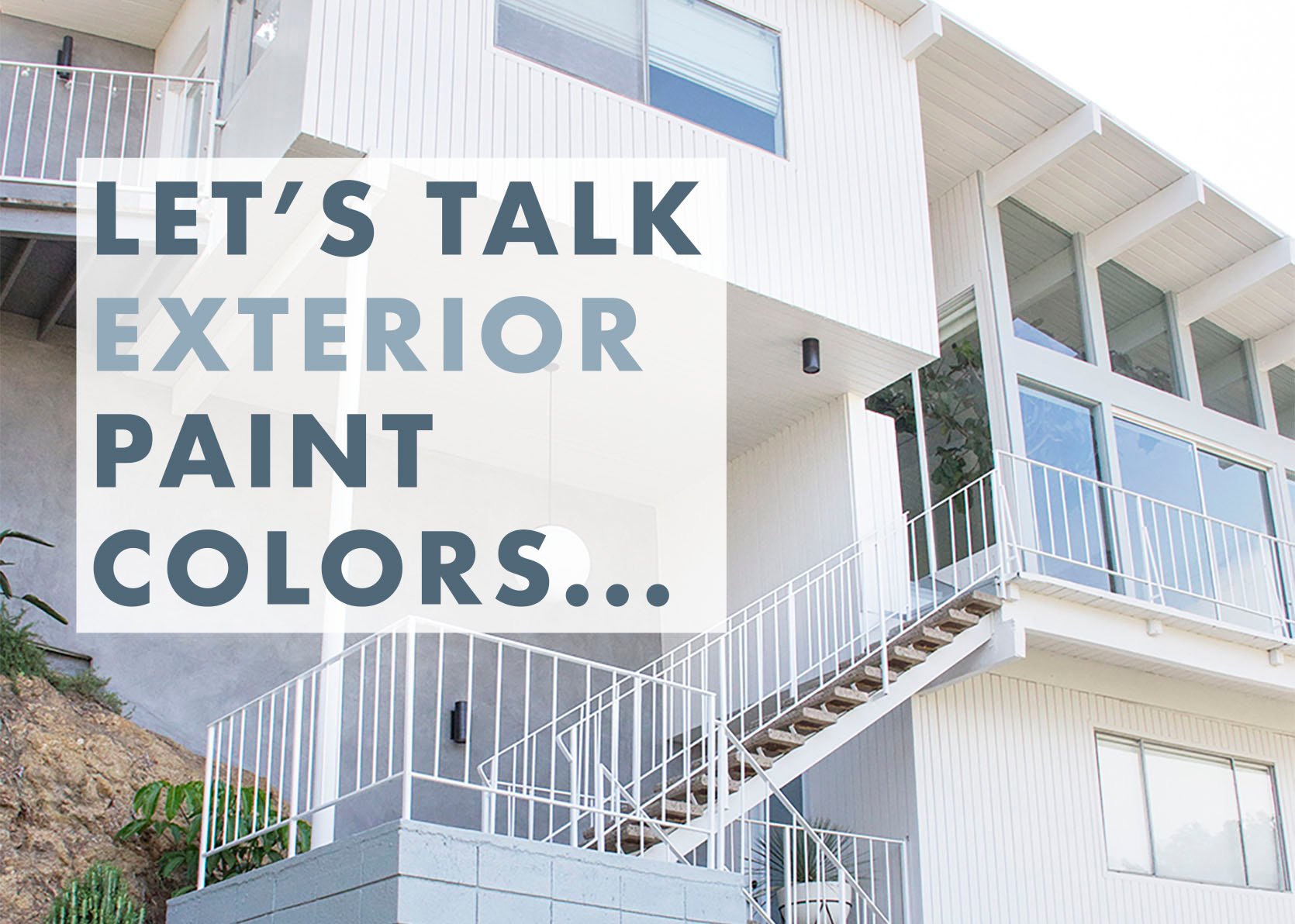
I’m a bit risk-averse when it comes to permanent decisions (which I’m not proud of all the time, actually) which can feel a bit boring in this age of color and pattern. But I’m still so glad that we painted this house a crisp but not too cold white, with the blue/gray and black accents. It was in sunny California, it was TALL (so a darker color could have looked really intense/overwhelming), and it was mid-century so I wasn’t going to mix like 3 colors. It was also west-facing (so any color would have looked FAR more intense when the sun was on it, which it was all the time) and this white felt fresh and very much matched the interior style. There was no setback in this house either – it was on the street so a bolder color could have been a real risky choice for the whole neighborhood. We plastered some of the walls to add some variation, depth, and texture. As you can see we cladded the majority of the house and painted the big stacked cinder blocks. I certainly didn’t want a traditional color (a muted neutral) and while I could have gone with a pretty blue or green, this white felt right and we were super happy with it.
Los Feliz House – 1921 Tudor

Blue Trim Paint Color: Down Pipe by Farrow & Ball


This house had the original exterior finish (I think a type of stucco?) where the color is mixed into the material and painting it just felt so wrong. So we left the finish and just played with the trim and window frame colors. I really loved how these colors played off each other and made it feel more “me” but what I do regret doing is painting the garage doors the white. Now I don’t remember if they just came white or if we painted them (I feel like I’m like Dory these days – I remember NOTHING unless it’s important), but I think the white got too much attention and the darker blue of the trim would have blended nicer. We chose the gray blue and cream to work with the tones of the plaster and it all felt so appropriate, vintage, and pretty.
The Mountain House – 1970s A-Frame

This house was another sad neutral that needed a point of view. It was a really gray sage which is starting to convince me that medium-toned colors might not be my favorite – that either light neutral, dark neutral, or a color might be more my preference.

We chose Laurel Woods by Sherwin-Williams and it’s PERFECT. I love this color. It can look really dark at night, but still pretty happy during the day.

Green Exterior Paint: Laurel Woods by Sherwin-Williams | Door and Back Deck Paint: Tricorn Black by Sherwin-Williams | Front Deck and Exterior Brick (not shown): Iron Ore by Sherwin-Williams
For this house, we did need to get the color approved by the HOA and I guess green isn’t typically on their list (which seems totally weird since it’s a mountain town and full of trees). But we got this one approved. We chose green because I wanted something dark and moody up here, but wanted it to blend into the surroundings, not pop out. It’s surrounded by trees and it’s meant to feel like a modern cabin so a dark green (but not too dark) felt perfect. I still love this color and think it was the right choice (especially with the almost black trim).
The Farmhouse – 1910


Exterior Paint: Pure White by Sherwin-Williams | Old Gray Trim Paint: Online by Sherwin-Williams | Blue Deck Doors Paint: Smoky Blue by Sherwin-Williams
I really struggled with this because Brian was SET on white and I was in the middle of such decision fatigue and self-doubt that I was like “ok, white it is”. Of course, there are a million whites to choose from so I still had to pick a color (we went with Pure White which we love, but it is PURE white so know that it’s bright). Now that all the landscaping has grown in with so much green, pink, and darker tones I’m so happy that it’s white – it feels really appropriate for a farmhouse and very classic.


I took these two iPhone shots recently, now realizing we need to get some new professional photos of the exterior, but you can see how the landscaping pops and it looks really really pretty, IMHO. ?
The Fig House – A Wedding Venue
10 years ago I designed The Fig House – an event space in Los Angeles and we painted it Hague Blue (by Farrow & Ball). It’s still one of my favorite colors. As you can see at night it’s one color and below, during the day it’s far more bright/saturated.
We loved the brightness and I think a lot of people wanted that for their wedding photos, but it’s a good example of how more pigmented colors change in the light.
And now for a few things to think about (that I thought about when we were deciding)…
What Region Do You Live In And What Vibe Is Your Neighborhood?
Obviously, Arizona is going to be more neutral, warm, and desert-y (and I would think you wouldn’t paint your house black since it’s so hot there), but then you look at Palm Springs and there are tons of pastels! Another example is that it could be kinda of weird to have a brown house in Key West when the rest of the houses are colorful. So while you shouldn’t let the region dictate your style, I would also want it to feel appropriate and not be the sore thumb.
But even within regions, there are vibes that you can lean into. Portland has so many vintage bungalows, Craftsman, and Victorian houses. Walking through some of the neighborhoods in NW or NE is so fun because of all the colors. If a vintage house has a lot of trim details, railings, moldings, etc – I think it’s a great opportunity to do something really unique (even if you do keep it safe). The more modern approach is to paint everything tonal and I think that can look good, but there is also something to be said for leaning into the whimsy of your house and you can handle it (and not missing that opportunity). I’m dying to do a Victorian house and you bet I’d paint it a few different colors and lean into bringing out the architecture and details.
What Color Are The Windows Frames?
A lot of newer houses (1980+) have white vinyl windows and we all know that replacing windows is extremely expensive. So if this is you, I’d try to paint your house a color that would work with your windows instead of making the white pop. My opinion is to go lighter or at least to paint the window trim white so that the vinyl windows recede and don’t become the focus.
Wait, When Can We Go Wacky?
Y’all. This is HARD. A wacky house, in a wacky neighborhood can be sooooo FUN. I love the right yellow house (with the right landscaping around it). I love a pink house, red house, cobalt blue, or even lavender (in the right neighborhood) and I don’t ever want anyone to tame themselves if they think they can handle a brightly colored home. Would I personally ever paint a house orange or lime green (or a combo of both?), probably not. But I could definitely see myself doing a blue/pink/yellow/red or green house if it’s a smaller house and the neighborhood could handle it.
The Bigger The House The More Color/Bold You’ll See
This is just basic science, LOL. Bigger = more, so while a small swatch might not be overwhelming sometimes the whole house can be once it’s painted. Same with the tone of the color – a color with a ton of pigment will go brighter and bolder with a lot of sun on it (in which case doing a more muted version might get you what you want). Maybe that’s where I’m going – if you have a big house, choosing a safer and more muted color might be the way to go whereas a smaller house can handle a bolder color because there’s simply less of it.
What Do You Think? What Is Your Favorite Exterior Paint Colors In Your Region?
I’d love to know your thoughts and feelings. I’ve only lived in New York (where we didn’t own), California, and Oregon. So for those of you looking for more advice please let us know. Do you love having a dark house? Do you regret the color you chose and why?
Opening Image Credits: Photo by Sara Ligorria-Tramp | From: Our Home Exterior Renovation