OKEE DOKEY. Today we are revealing our primary bedroom and quite possibly the least “farmhouse” room in the house. I mean, I love it, but there is almost nothing in here that Joanna Gaines herself would deem farmhouse-worthy. You are going to have to read the whole post to fully understand my feelings about this room (because they are highly nuanced, change daily, and I’m still rectifying it all). At the end, there is a list of what I would change if I could snap my fingers (and whether or not I will). But I will not start 2024 or this post by “yucking my own yum” (as we’ve taught the kids to say – it’s the PG version of “pissing in my own cheerios”). Besides, it’s just design and the longer I’m in this career/game/life the less attachment I have to my own successes and failures. Y’all, getting older is awesome for general perspective-making. Now, let’s get into it ?
Wall Color | Rice Paper Shade | Rug | Bench | Nightstands | Table Lamps | Art Above Bed | Sconces | Switch Plates
This room actually turned out pretty darn GREAT after much tweaking (and a big shout out to my favorite rug from our RugsUSA collection – the Merrick). It’s calm, cozy, high functional, and objectively well designed – it just turned out different than I had intended, although TBH I didn’t have a clear direction (thus the problem). It’s easy to keep neat/tidy (mostly thanks to the large closet down the hall – bless that closet) and on Sunday mornings I let the kids watch TV while I throw on the fire, read my romance novels, and feel so grateful that I have this beautiful, inviting, and cozy bedroom. And listen, the challenges were all self-imposed because this room is basically a new build so I also got to learn a lot. Win/win (kinda).

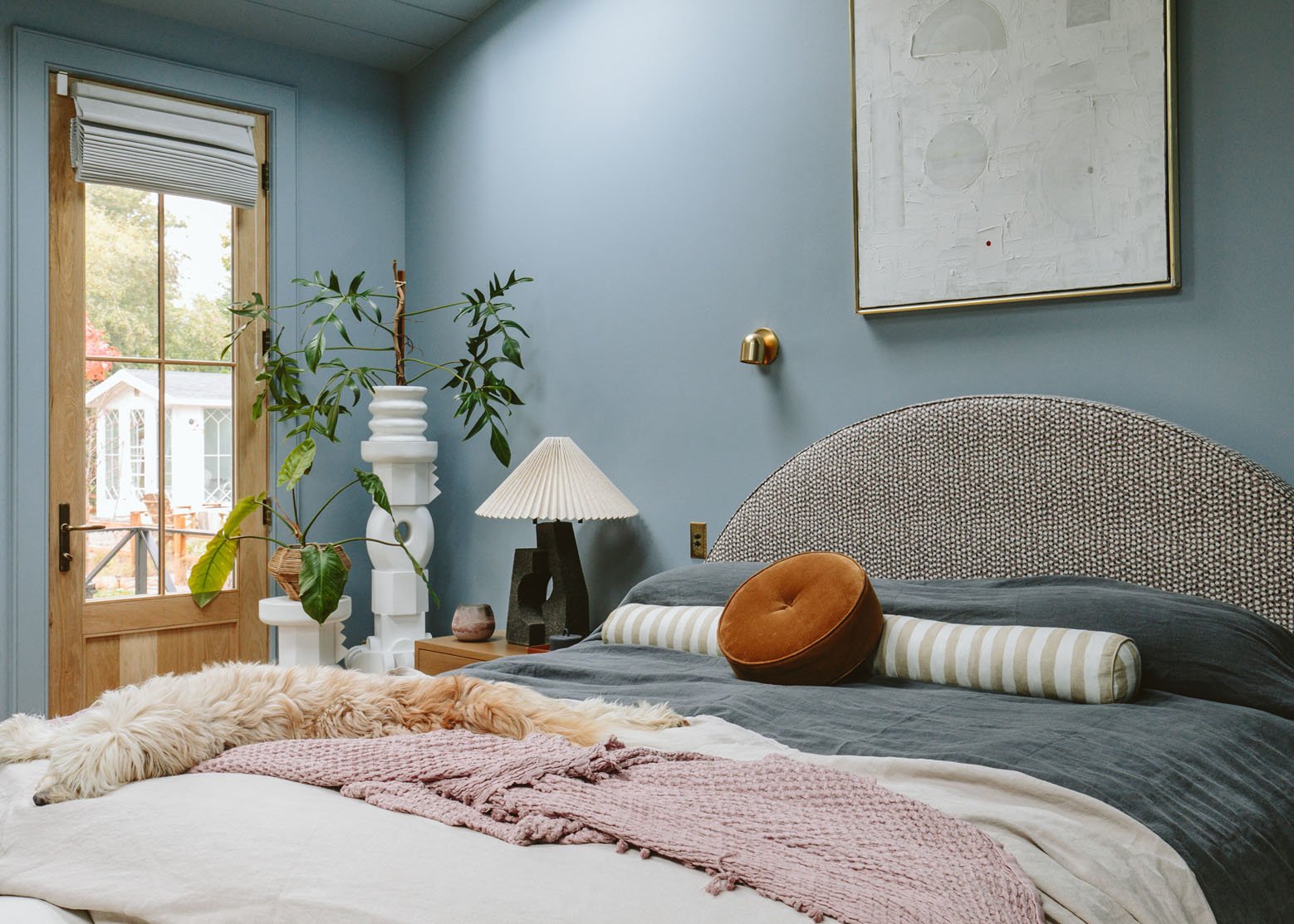
Bed (custom) | Bed Fabric | Round Pillow | Bolster | Linen Bed Covers | Throw Blanket (similar)
The bed, as you might have read, was custom-designed for the guest room (and works so perfectly in there) but a week before the Real Simple shoot the bed we ordered still hadn’t arrived. So we had them assemble this here (and liked it enough to keep it in this room). It’s a Rebecca Atwood tiny print fabric that has mauve, cream, and blue in it. And the arch works so perfectly with the reading sconces. The coverlets are from Parachute and they are GORGOUS. If I could give one note (and I like a note, it needs to be much bigger). We layered two so that it could cover over the pillows without showing the base. They are so pretty and feel like they’ve been washed a million times. Also, that long bolster pillow is the best and that round pillow on top, while being super hard and not exactly a head-resting pillow, looks pretty darn cool.

Plant Stand Sculptures | Lamp | Nightstand
A photoshoot can really light a fire under your ass. About 2 weeks before the shoot, I still hadn’t upgraded our nightstands (that were admittedly too tiny for the room). Due to procrastination, I didn’t have a million options to choose from that would have arrived here in time. Luckily these from Crate & Barrel were a great scale, were super simple, a mixed material (leather shelf), and checked all the boxes (except vintage, which is what I was waiting for and never really manifested). They are pretty darn great. The plant sculptures are from Lulu and Georgia, designed by Sarah Sherman Samuel (and y’all most of this I paid for FYI). Now admittedly the plants on those sculptures are giving much more of a Palm Beach vibe, which this house (and me) certainly are not, but I really like them!!!

Sconce | Accent Chair | Ottoman | Ball Pillow | Side Table | Wall Art
I love this shot so much. The chair and ottoman are from Crate & Barrel (and so comfy/cozy and on the lower side FYI). I LOVE its color/texture against the blue wall color so much. The articulating sconce from Rejuvenation is dope, and the art from Bonita Interiors is one of my favorites (and yes, I wish it were centered on that wall but then it would be in front of the light switch that we fully don’t need. Ha). Speaking of things we don’t need – we never use that door. It’s pretty though!!!! Whoops.

Fireplace | Fireplace Paint Color | TV | Blue Vase
The fireplace is pretty darn cozy and the TV above it (a Samsung Frame, obviously) gets use on the weekends when the kids dominate the family room with garbage and I fold clothes while binging my own garbage (but we don’t watch TV in here as a couple, strangely, like EVER). The fireplace is from Heat & Glo and is awesome. It works via remote and you can control the heat level and the flame height. It does make the room really warm so I only use it on cold days (or sometimes just for 15 minutes for a mood boost).
The Katy Skelton bench that I’ve had forever actually lives at the foot of the bed, but that area under the window looked super empty and off-balance without it. So for the shot, we shoved it there.


This is probably my favorite shot here. That warm taupe mohair against the dark blue, with the brass and our pretty rug popping in – it’s just so balanced and cozy. This is probably the best representation of the paint color – it has a lot of depth to it. Also, look closely and you might see an alpaca in the backyard:)


The window treatments are so wonderful, both custom from Decorview. The shades are what we use daily and they are so easy and functional (you don’t have to pull them all the way, it’s a mechanical pulley system that is so smart – see on stories). But the shades didn’t feel like enough so we added these dramatic curtains and the whole room really came together after that. It’s a super dark navy blue that adds so much drama and depth. Thank you Decorview!!

Picture Light (unavailable) | Mirror | Switch Plates | Planter Stand (similar) | Fluted Planter (similar)
This side of the room you’ve probably seen a ton during all my selfie fashion stories. The picture light, light switches, and the mirror are all from Rejuvenation (a large and lovely partner on this project). I only wish that I could magically move the sconce down because the space between the mirror and the sconce is more than I’d like. But it’s so not a big deal so it’s likely going to stay.

So, What Would You Change???

I’m going to be VERY picky here, and that’s ok (remember I’m the only one that can be offended and I’m not). I love every single thing in here, but are they all right in this home? Together? Maybe not. Here is what I’d change if I could snap my fingers:
- Change the paint color to Eventide by Sherwin-Williams. I just painted a room in my brother’s house Eventide and it is SOOOO beautiful. I was instantly like, “Oh shoot, this is what our bedroom was meant to be”. I debated it originally in here but I feared it would be too gray. But once on all the walls it’s not – it’s so beautiful and happy (despite being a light really gray-blue). I love this color, Debonair, but again I think it is better in a room without 7 windows (most south-facing) bouncing light around a lot and perhaps making it more bold and intense than intended (like all paint colors, it is very specific to the light you get, the direction you face, the scenery outside, etc). When the skylights and windows are closed it’s my favorite color ever – so it would be incredible in a dark room. Will I do it? Maybe. And if I do I might consider repainting the trim and ceiling white (curious if the paint everywhere trend is going to subside soon).
- I do want to move this bed to the guest room and buy a less contemporary style bed in here – just to make it more classic. However, we are debating a sofa bed in the guest room so that the kids can use it as a den during the winter so not sure of the usage yet. I love this bed and it honestly all looks so good together in here and it doesn’t bother me at all, but if I could snap my fingers the room and the bed would be just a bit more timeless, less on-trend. Will I do it? Maybe. But no rush at all.
- Make the mirror taller or move the sconce down – basically reduce that space in between so they relate to each other better. Will I do it? Nah. I might order a larger more articulating sconce instead, but I don’t feel like hiring an electrician to move it down, then a painter to repaint. Too much work.
- Had I known I was going to paint the room a medium color I would have put in either pretty spotlights, black recessed lighting, or a J box so that the hanging paper sphere could actually be lit LOL (I don’t love the white cans in here). Will I change it? Nope. I don’t care that much.
- If I could go back in time I probably would have skipped the door – we just rarely use it. No harm in having it but just not necessary.
So that’s our bedroom reveal:) She’s pretty, cozy, and so comfortable and helping me hibernate during The Great Long Dark (aka the PNW winter). xx
Primary Bedroom Resources:
Wood Flooring: Oregon White Oak by Zena Flooring
Windows: White Oak, Aspen Casement by Sierra Pacific Windows
Roman Shades: Decorview
Drapery: Decorview
Fireplace: Slimline 7X with Tranquil Greige Refractory Brick by Heat & Glo
Blue Wall Color: Debonair by Sherwin-Williams
Current Fireplace Color: Big Dipper by Sherwin-Williams
TV: Samsung
Skylights: Skylights with Room Darkening Shades by Velux Skylight
Lights and Switch Plates: Rejuvenation
Custom Bed: Raleigh Hills Upholstery
Bed Fabric: Rebecca Atwood
Nightstands: Crate & Barrel
Table Lamps: Crate & Barrel
Bench: Katy Skelton
Plant Stand Sculptures: Lulu & Georgia
Rug: Rugs USA x Emily Henderson
Accent Chair: Crate & Barrel
Ottoman: Crate & Barrel
Side Table: Article
Large Mirror: Rejuvenation
*Design by Emily Henderson and ARCIFORM
**Photos by Kaitlin Green