It’s that time of year again when our future is predicted through a color…Pantone’s color of the year. It never ceases to create A LOT of opinions and this year was no different. But before we get into “Peach Fuzz”, yep, that’s the name of this year’s color, I thought we could take a tiny trip down memory color lane to see how we got here.
2021
In 2021, there was not one but two colors of the year. This was how this choice was described on the Pantone website: “Practical and rock solid but at the same time warming and optimistic, the union of PANTONE 17-5104 Ultimate Gray + PANTONE 13-0647 Illuminating is one of strength and positivity. It is a story of color that encapsulates deeper feelings of thoughtfulness with the promise of something sunny and friendly.”
So while the colors don’t necessarily make your eyes light up with wonder, the thought behind them was obviously thoughtful.
2022 & 2023


Then the next two years were saturated and vibrant. Dare I say hopeful?? Here was the meaning behind Very Peri in 2022: “Very Peri helps us to embrace this altered landscape of possibilities, opening us up to a new vision as we rewrite our lives. Rekindling gratitude for some of the qualities that blue represents complemented by a new perspective that resonates today, PANTONE 17-3938 Very Peri places the future ahead in a new light.”
And here was the meaning of Viva Magenta in 2023: “This year’s Color of the Year is powerful and empowering. It is a new animated red that revels in pure joy, encouraging experimentation and self-expression without restraint, an electrifying, and a boundaryless shade that is manifesting as a stand-out statement.”
And then came Peach Fuzz…

Here is a brief description of why this soft hue was chosen for our 2024 color of the year: “PANTONE 13-1023 Peach Fuzz captures our desire to nurture ourselves and others. It’s a velvety gentle peach tone whose all-embracing spirit enriches mind, body, and soul.”
Even Pantone was like “Maybe this is a year we take a step back and work on ourselves and help others.” And while we all have our opinions, I think we can all agree that some self-reflection to better serve ourselves and those around us is exactly what we need. Ok, here are our reactions!
From Emily: My first reaction is this: I love the idea of peach, but unsure I could commit to a whole room without it going lighter (but would that look fleshy?). But ultimately I’m drawn to a little more brown in it (think a lighter Dead Salmon by Farrow and Ball). But I am typically a little behind these trends as I’m less of a color risk taker than others. So I’m excited to see how it plays out. I will say that once we get going on the other house on the property (the one we don’t actually live in) I want to take more risks. In FACT, my dream is to have every room be a different color so that I can tell all my friends and family to come over and experience the color in a room before you commit, because man, just a large swatch often doesn’t sell it (or does and then OOPS).
From Mallory: Peach Fuzz is certainly not the color of my year and I’m sorry to say it. To me, I am more of a neutral person, but if I’m going to add some color, I like something bright and poppy and quite honestly, something that looks a little less like my flesh. Sorry to be a hater, but this color is not for me. I could be convinced in the right room (I really do love Arlyn’s bedroom since it’s softer) but in my own life, I can’t see myself utilizing this color anytime soon.

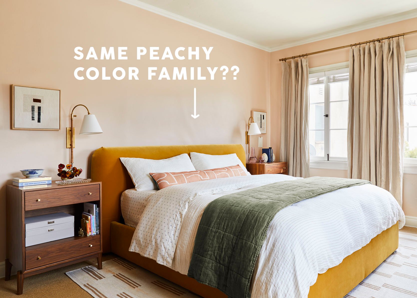
From Arlyn: Honestly, I was a little surprised by the Pantone Color of the Year. Pantone normally goes very esoteric with their picks and Peach Fuzz feels pretty in line with what I’m seeing as a trend toward warmth in design. If you followed my three-year bedroom makeover journey, you’ll know I’ve been into peach since 2020. Wait…am I a trend setter? Did Pantone read my post about picking a peach paint color all those years ago? Obviously I’m kidding, but it’s a happy yet soft shade that I hope to see paired with deeper, richer jewel tones or grounded earthy neutrals.
From Jess: When I first saw the announcement, it just felt too soft for how heavy the world currently is. Then after reading the explanation, I guess that’s the whole point. Now, as a color, I think it’s a bit too saturated and is almost the exact color I painted my bathroom at 10 years old. It was A LOT. Of course, it could look awesome in that exact hue with the right decor, but I prefer the lighter peach tones that Arlyn and Caitlin chose for their spaces. Those tones felt happy instead of overwhelming. I’m curious to see if this more saturated version really takes off this year.

From Caitlin: Is this a safe space? Can we talk a little trash? My hot take: these color of the year predictions have been duds since 2016. (What happened in 2016, you may ask? Well, the folks at Pantone picked a little shade called ‘Rose Quartz,’ which you may also know as, MILLENNIAL PINK. That was a SPOT ON color of the year, you know?) And let’s be real – I love peach! I spent 5 months (from November to March!) trying to find the perfect peach paint for my living room! But this shade just misses the mark for me in a way that’s a little eye-twitch-inducing. It’s just pulling a little too yellow or orange – I feel like the fleshier, glowier, pinker hues are actually what’s trending right now. So I guess my review would be, uh, it’s half right? It has the right spirit? But like…WHY DID THEY PICK THAT EXACT SHADE?
From Gretchen: This color of the year is a doozy for me. The name, Peach Fuzz, gives me flashbacks to discovering my upper lip hair in middle school. Yikes. While the name certainly doesn’t fill me with those “warm” feelings Pantone attributes to it, the color itself…sort of does? It reminds me of an old-school, mid-century tiled room, fairly identical to the current vintage bathroom tile of one of our very own (hey, Caitlin!). Now, I love a vintage-inspired color palette, so I could absolutely see it working and feeling warm in the right environment, but it just feels a little dated to me and definitely doesn’t capture “contemporary” the way the Pantone Gods proclaim, IMO.
Ok, so that’s what we think! What do you think?? Let’s chat in the comments.
Love you, mean it.
Opening Image Credits: Design by Arlyn Hernandez | Styling by Emily Bowser | Photo by Sara Ligorria-Tramp | From: 3 Years In The Making Then An Unexpected Move: Arlyn’s Bedroom Reveal Is A Lesson In The Beauty Of “Unfinished” Design