Just when our kitchen was completed, our deck was done, and we thought we were finally finished with any home renovations for at least a few years, we decided to try for a third baby. Our two perfect kiddos had always been the plan, but my husband and I also always said that a benefit of starting our family while we were young was being at liberty to change our minds.
One of the things that might have stopped us from trying earlier was that we loved our Los Angeles neighborhood and had no desire to move. (Would you want to give up this view?) But we also weren’t quite sure how a third kid would work in our current space. I’m all for siblings sharing a room, but with a bigger age gap, it felt less than ideal (my older two kids were already 5 ½ and 8 ½ when their baby sister was born).
Our first thought was to add another bedroom to the front of our house to make space for the baby, but when we went to get permits, we found out that most of our front yard is city property (!!!), meaning we didn’t have the space we thought we did for an actual addition. It was a major disappointment, but given our past renovation experience we knew we just had to get creative and find a way to make it work! (We’ve done so much work on our house that my 6-year-old recently requested in total earnest that we build him a new room for his LEGO creations.) Back to the drawing board we went…

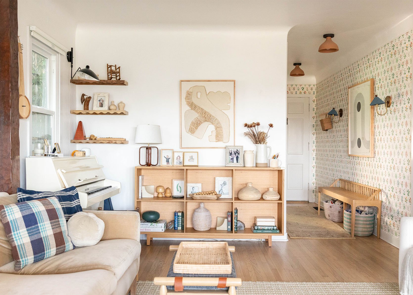
Before this round of renovations, our front door opened straight into the living room. I always wished we had a more formal entryway with a good place to drop our shoes and bags. So, with that in mind, we came up with the idea to add interior walls to build a new bedroom and add an entryway at the same time. I have trouble visualizing things on paper, so my husband helped me prop up my kids’ Nugget play couch cushions and some seamless stands to see how everything would look in real life.

As it turned out, adding interior walls was also a huge money and time saver. My husband and his contractor father even did all the framing themselves, and we only had to hire someone to do the drywall, electrical, and paint!

Bookshelf | Framed 3-D Artwork | Framed Hallway Print | Bench | Flushmount Lighting | Sconces | Wallpaper
We got the entryway I always wanted, saved so much money versus a true addition, and made the most out of an underutilized spot in our super-long living room. Necessity really is the mother of invention, isn’t it?

Dresser (vintage from Bananafish Vintage Furniture) | Crib (Facebook Marketplace but here’s a similar one) | Lamp (unavailable) | Side Table (vintage)
I know there are no guarantees when it comes to getting pregnant, but as it turns out we found out we were expecting Story Salinger Saul not long after the new room was completed. We only had the space for a tiny 8×10 room (no closet, so we can’t officially call it a “bedroom” if we ever decide to put our house on the market), but it feels perfect for our family. There will most certainly be a loft bed in Story’s future to free up floor space once she’s out of the crib, but what kid doesn’t think loft beds are super cool?!

Mirror | Dresser (vintage from Bananafish Vintage Furniture) | Pear Basket | Canopy | Wall Hanging (DIY) | Mobile (DIY using wool ornaments from various Etsy sellers) | Changing Pad Cover (similar) | Framed Print (similar) | Play Mat

Mirror | Dresser (vintage from Bananafish Vintage Furniture) | Pear Basket | Canopy | Crib (Facebook Marketplace) | Wall Hanging (DIY) | Mobile (DIY using wool ornaments from various Etsy sellers) | Changing Pad Cover (similar) | Framed Print (similar) | Play Mat


While a small space has its challenges (layout can be super tricky), I find it much more manageable to decorate. I only had an 8×10 room to fill so I was able to focus my energy on a smaller number of really special design details, instead of stretching myself thin trying to furnish a giant room.


The inspiration for Story’s nursery was California Casual-Meets-English-Countryside. Scalloped edges, whimsical details, ditsy florals, and patterns mix with natural wood tones. It’s meant to be perfectly imperfect!


Scalloped Shelving | Quilt | Heart Pillow (no longer available) | Gingham Pillow | Curtains


Framed Print (similar) | Baby Wraps | Bookrack (in white) | Switchplate Cover
At this point, I’m big on challenging the assumption that having kids always necessitates more square footage, a huge car, more money, a move to suburbia, or more, more, more of anything. “Want better, not more” is my motto when it comes to design. I hope this project makes a good case for turning a starter home into your forever home, living with less stuff, and taking a leap of faith when something (like that third baby!) feels right.


We care a lot about the planet, so this solution also felt much more in line with those values, too. We shuttle our brood around to ballet, basketball, and gymnastics in a single car. I made a commitment not to buy any brand-new baby items this time and source most of Story’s clothes secondhand. I am a stickler for clearing any clutter and not buying things we don’t really need. I’d rather have a smaller, more efficient space that feels creative, comforting, and full of love.

Want to see more photos of our space? You can follow along here. And thanks to my friend and neighbor Lucia Tran of Her Studio for the beautiful photos!
*Design by Ilana Saul
**Photos by Lucia Tran of Her Studio

