There have been many instances in my life where people have told me I’m wasting my time, money and emotional energy decorating my rental homes to the level I do. Things will work in one place but not in another, they say. Things get damaged in moves, they say. Blah, blah, blah, they say. While I 100 percent understand the realistic shortcomings of throwing yourself into a “temporary” home, I refuse to let my home be a boring shell because of the hope of homeownership one day. Especially living in Southern California where the median sold price of a home in Los Angeles was $1,010,709 in July 2024.
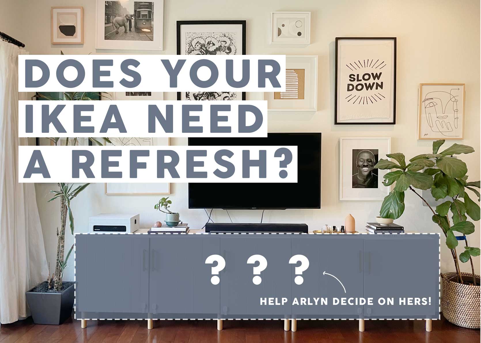
But this isn’t a story about going all-in on decorating a rental or not. I already wrote that one last year. It’s the one where “things will work in one place but not in another” (they said), and I’m figuring out how to adjust. For any reader who has been around since 2019 when I debuted the makeover of the dining room in my previous home, you may recall this large IKEA Besta unit I used as a wall-to-wall sideboard. (It’s actually two units—one three-door media cabinet and one two-door storage cabinet.) Here’s a little reminder:

Wasn’t that so pretty?!? I LOVED the putty grey against the green-blue walls (Inchyra Blue by Farrow & Ball for anyone about to go into the comments and ask). These Besta units were my main storage hub when I lived in Florida, and it, of course, came with us when we moved to LA. In that apartment, it was used as a media cabinet, but it didn’t work in the space where we had our TV in our last home. Luckily, it happened to fit nearly exactly under the two windows in the dining room. The bright white, glossy doors I had on it previously felt shocking in the dark, moody space, so I worked with Semihandmade to get new doors and hardware. I opted for Sarah Sherman Samuel’s Beaded Front door in Desert Grey, which is a much warmer color than it’s showing up in the photos above.

When we moved from our 1930s Mediterranean rental last year to a slightly more spacious townhouse, I did a little switcheroo. I took the Article sideboard I was using as a media cabinet under my TV and put it in the dining room (where frankly, it belongs), and then brought this large IKEA cabinet back into the living room as it was in Florida.
We’ve lived with it for over a year and it works well in the room. It’s a good anchor piece to the big open wall that needs grounding, plus it is amazing storage for toys, board games, our modem and wifi router, tons of DVDs we never watch, etc., etc. Since we first put it into place, I knew the coloring fell a little flat. The walls are a landlord-picked white and we’re not going to be painting. The floors are a faded cherry. Suddenly, the warm grey that mingled beautifully with rich jewel tones in my old home didn’t feel very special.
Rather than get a new cabinet (because…storage…and waste), I’m thinking of just swapping the doors again. I can use these doors in the two Besta units in my husband’s office to jazz those up and get something in here that just might propel me to refresh our living space—something I’ve wanted to do since we moved in but haven’t gotten around to prioritizing.

Sectional | Rug | Coffee Table | Sideboard | Throw Blanket | Table Lamp | Lamp Shade (similar) | Side Table (no longer available) | Curtain Panel | Round Green Pillow | Beige Lumbar Pillow | Floral Pillow | Maroon Pillow | Striped Bolster Pillow
While I was working on a post earlier this year about how to spruce up a blue velvet sofa, I found a company called Fronteriors that specializes in quality doors from IKEA cabinets, and the idea for something different for this furniture piece has been planted since then. I had my eye on them for years, but they didn’t sell in the US. Luckily, that has recently changed. I cooked up the above moodboard based on one of the color palettes I made for that story and I fell in love with it. I’ve been wanting a more playful, colorful yet sophisticated aesthetic (maybe I think it will go better with a bunch of toys everywhere?!?), and I thought the blue-stained oak doors from the brand would be a great solution. I especially love that they also sell tops and sides to fully encase the Besta unit, which I’d prefer to the white sides and top I have going on now.
But because I’m a researcher, I had to see what other options were out there. Clearly, there is big business for selling after-market IKEA door fronts for storage pieces and kitchens, but the funny thing is, they are all selling super similar products. Most of what I found were flat wood doors, a quarterline Shaker (a very thin border around a flat front), a traditional Shaker, caned front doors with a wood border, or something like what I already had that looked like a modern beadboard.
Also, the colors across all brands were virtually the same. Everyone had the following: olive green, dark green, light blue, dark blue, neutral caning, oak, white oak, and walnut. There were a few wild cards in the mix, but I kid you not, it was like déjavu with each website I checked out. It’s a good thing I’m fairly basic and also wanted what was trending in cabinet colors and styles.
Design is a game played best in tiny details, though, so I did some virtual window shopping to see what I could find, even if the differences were minor from company to company. Some had just the right shades I was looking for, others had door fronts with graining I wasn’t totally on board with. And of course, price is a big factor here as there was a rather large variation depending on what materials were used, quality level, and where it was made. Let’s start with Fronteriors.
As I mentioned, I’m leaning toward using something from this website mostly because of the opportunity to also purchase a top and sides for my Besta units. That just makes it feel so much more elevated and finished. They also sell hardware and legs, though I’m not ready to wrap my head around that just yet.

Top row, left to right: Oak Door for Besta in Natural | Oak Door for Besta in Light Blue | Framed Door for Besta in Latte | Middle row, left to right: Cane & Oak Closed Weave Door for Besta in Light Blue/Natural | Cane & Oak Closed Weave Door for Besta in Beige/Natural | Framed Door for Besta in Light Blue | Bottom row, left to right: Top & Sides Closed Weave Cane & Oak for Besta | Top Framed for Besta | Top & Sides Oak for Besta
The light blue oak door looks kind of intense in the singular product image, but it looks much more muted in some of their lifestyle photos so it’s hard to know whether it’ll be a good color moment in my mostly neutral living room or an immediate “oh no, what did I do?” once I see it all together. The neutral closed weave cane in the beige door is kind of interesting, too, though not helping me out in any color departments. I also pulled their framed door in latte but I think that might be too similar to a warm grey that I already have (I know it looks green here, but it’s less so on their website on product images).
This brand was new to me but they have a line from famed DIYer Angela Rose that’s pretty nice, especially if you’re shopping for kitchen cabinet door fronts, rather than storage pieces like I am. They offered a handful of other styles but the skinny Shaker, wood grain slab and slim Shaker detail were all up my alley. Their Only Olive color was a pleasant surprise when I superimposed it in Photoshop on my cabinet (keep reading) so, it’s a strong contender. I do, however, love the warmth and kind of rustic nature of their oak finish because everything I have in my home feels a little bit too pristine and it could use something to shake it up.
Oh! Another cool thing about Nieu is that they give you the option to select your own custom color (say, to match a wall color) for an additional fee.

Left to right: Skinny Shaker in Only Olive | Wood Grain Slab Vertical Grain Door in Natural Oak | Slim Shaker Detail in Only Olive
It would be silly of me to pass over IKEA for doors for my IKEA cabinet. When I first bought my Besta units, there were not many options beyond glossy white (which I purchased), white Shaker, a really bad weathered wood veneer, and some others that weren’t notable enough to remember. But they’ve since upped their ante, likely because they were losing business to a bunch of other companies one-upping them in the style department. I like all of these actually, but not sure any are right for my living space.

Left to right: BJO?RKO?VIKEN Door in Brown Stained Oak Veneer | MO?RTVIKEN Door in Dark Gray | LAPPVIKEN Door in White Stained Oak Effect
Another new find for me. Superfront doesn’t ship all of its products to the US (like its stone tops), but they do have a ton of great options that make it stateside. Their Vertical line was probably my favorite because it’s similar to what I already have in style but in some warm or fun colorways. The Biscotti wood color is so nice and might just work with my cherry floors. The dark Thunderwood color is very cool, but not for this room, and the Muddy Blue looks far more Tealy Blue if you ask me, but that could just be the rendering of the product on their website that’s not reading right.
Don’t miss their great legs and bases. The Takumi low base is calling my name…

Top row, left to right: Vertical in Muddy Blue | Vertical in Biscotti Wood | Vertical in Thunderwood | Bottom row, left to right: Takumi Low Base in Honey Wood | Takumi Low Base in Biscotti Wood | Plinth Base in Biscotti Wood
If it ain’t broke, don’t fix it, they say. I had a great experience with Semihandmade when I first worked with them, and I do love their Quarterline collection, also designed by Sarah Sherman Samuel. I think the Night Sky hue would be so beautiful in the right room, but probably not for mine. The white oak could be a contender, but the more I see color, the more I want it.

Left to right: White Oak Frame Front for Besta | Night Sky Quarterline Front for Besta | Agave Quarterline Front for Besta
Norse Interiors had a lot of variety in door design, but I didn’t want anything heavy-handed or graphic. Just simple wood or color is all I need for such a large furnishing. They also sell tops and sides as you can see on the bottom left-hand corner of the lineup below which look so great. It’s really thin which feels modern and clean. If my floors weren’t dark cherry and I didn’t already have two dark walnut pieces in the adjoining dining room, I’d be tempted to use their walnut doors on my Besta. The white oak is nice, but maybe a little too expected these days.

Top row, left to right: Cane in Earthy Sand | Astrid in Luxe Green | Walnut | Bottom row, left to right: Amelia in Classy Navy | White Oak | Besta Top & Side
Watch My Besta Transform
Prepare yourself because I’m about to absolutely Wow you with my Photoshop skills. Who needs AI when you’ve got my talent? (I’m kidding, obviously, as I just slapped some flat door fronts on top and everything is kind of crooked). Some baby-proofing latches are dangling, my curtains are too short—those will also soon change—some art is missing from my gallery wall, the trees need to be swapped, and that elephant print is crooked from the last minor earthquake felt around here. But this is an exercise more in “you get the point” than quality mock-ups.
Another note is that the light that comes into this room casts a bit of a green tone because my sliding glass doors look out to tons of greenery, so you won’t see that come across on the door fronts here as you would IRL.

Fronteriors Oak Door for Besta in Light Blue
Okay so…I think I really like this, even if it’s pretty specific. You don’t often see a blue wash over wood grain, and depending on the saturation and exact hue in real life, it could be a contender. Especially if the top and sides are also this same finish. Hardware and new legs would round it out nicely, I think?

Fronteriors Cane & Oak Closed Weave Door for Besta in Beige/Natural
But dang, this actually looks nice, don’t you think? It’s quiet but textural, won’t feel tired after a few years (I hope), and allows me to play around with my color palette a bit more. The only thing I worry about is grubby toddler hands full of Crayola finger paint, which is a very real concern on that caning.

Nieu Cabinet Doors Wood Grain Slab Vertical Grain Door in Natural Oak
These are from Nieu and I thought I’d love them but…I don’t think I do. Especially not with my shiny cherry floors. If I had something else going on down there, it could be a contender for bringing in some warmth but I think it’s a pass.

Nieu Cabinet Doors Skinny Shaker in Only Olive
Well, well, well…if it isn’t a slim Shaker front in an olive green, just like everyone else. But friends, I, uh…really like it. Imagine this set on a plinth base rather than all those stick legs with some beautiful wood, brass or bronze hardware. They don’t offer sides and tops, unfortunately, but I could get a nice piece of wood or stone cut to size to solve at least half of that equation.

Superfront Vertical in Biscotti Wood
This is a much better wood tone for this room, I think, but it just feels like too many lines. I think I’d prefer this on a smaller piece (maybe a three-drawer cabinet rather than a five-door), to be honest. They sell beautiful wood hardware in the same stain as their doors, which would be cool and modern, plus their bases are SO good, but I’m not sure this is the one, sadly.

Superfront Vertical in Muddy Blue
…and neither is this one. The blue is not what I’m looking for, but it could be cool in someone else’s home, for sure (or if my walls were a different color).

IKEA MO?RTVIKEN Door in Dark Gray
And lastly, I threw some IKEA doors up on the cabinet and it’s kind of a cool look. The front is a mesh-like grate, which I don’t want because of all the STUFF in there, but it’s a nice option to consider if you weren’t me.
I didn’t make options for all the brands or selects from the product boards because when I was in the thick of Photoshopping, I just knew I wasn’t going to end up liking some. All of these had potential…I thought, but now I’m much closer to a real decision. I’d love to hear what you think, though it’s not necessarily an “ask the audience.” Keep in mind my blue velvet sofa will remain for a while, and I’m adding color via other soft goods like my rug and curtains.
Thanks for reading, friends, and I’ll catch you next time!