Arguably the “biggest” time of year to discuss color is fall. It’s when all the fashion trend reports hit, when paint companies and the like start releasing their Color of the Year, and generally when everyone starts talking about what might be waiting for us when the calendar crosses over. Of course, trends don’t just reset come January 1 (or September 1), but the air is always buzzing with the electricity of newness after Labor Day.
One of the most powerful color trends of the past year was red (whether it was expected or unexpected to you and your home), but there’s something else on the horizon, and I wasn’t totally sold on it…until now.
It’s no secret that fashion influences what makes it into our homes, so when I saw a handful of reports coming out (including this one from The Everygirl) stating orange as the color to watch, I had my doubts. Orange is notoriously a tricky color to work with (or wear), unless of course you slide it around the color wheel to have a bit more brown in it (terra cotta) or a bit more red in it (rust or ginger).
But then, as I was working on the stained glass article from last week, I found this hallway from Reath Design that I couldn’t get out of my head. It’s drenched in a rich orange paint, balanced by a creamy, peachy tone on the ceiling, and brought to life with the kaleidoscope of tones on the door’s panels.
Had this room been red, for instance, it might have still been beautiful but it would have been INTENSE depending on the specific shade. But in this earthy orange, it’s welcoming, warm, and vibey. It played nice with the seven other colors showcased in the compact area. It was part of the chorus line, not the protagonist. And I loved it.
Do I…love…orange now? Huh? Was my brain just trying to jump on the early bandwagon before it became too big so I could say “I knew it would be a thing”? Was I just ready for fall, where all things oranges always reign supreme? Was I just reacting to this specific room? I had to dig deeper.
So I did what I always do: Go back through my archive of saved images to see what I can find, and then see what related posts I could get from it. I immediately found this kids’ room I bookmarked weeks ago by designer Henri Fitzwilliam-Lay that appeared in one of my favorites, House & Garden. I loved how the orange wasn’t the “star” but rather the anchor to the turquoise bed and the citrine rug. It feels “built” into the wall as the color is carried onto the window casing and the window seat on the bottom right-hand corner of the image. If I do a little manual peek-a-boo and cover the orange with my hand, it’s certainly a cute room but it lacks depth. The room *needs* the orange.
And because I know that bedroom image might be a bit scary for some of the neutral lovers out there, my eye also caught this catalog shot from Joybird that an old colleague of mine Kyle Schuneman styled. It features a punchy orange velvet sofa in an otherwise neutral living room. In theory, this space would work with *any* bold color as the standalone key color moment, but the orange works so well to pick up the warmth in the stone wall to the right and the other wood elements throughout (like the piano!).
And because my University of Florida DNA runs deep, a little orange and blue (our school colors) always feels like a winning combo to me. Summer Thornton went with more of a pumpkin shade than a tangerine, and then mixed in plenty of blue at varying intensities to keep it balanced (the buttery wheat of the fabric in the foreground and the mustard drapery trim round out the palette).
The more I started crushing on orange, the more I realized why: orange works anywhere that red or yellow would, because well…it’s both red and yellow, obviously. In its warmer iteration, it can also visually fill in the need for wood tones in a room, too, which acts as the warm soul of a space. It can be subdued or sassy, used in small amounts as the guest star or take full control of a room as the main color.
I think somewhere in my head and heart, I always knew this. It’s just kind of common sense. But outwardly, I always held out my palm like a Heisman Trophy winner to keep it at bay from my rooms or my design interiors.
BUT ORANGE IS THE NEW BLACK (and red, and yellow, and pink). Elle Woods may have stated that whoever said orange was the new pink was seriously disturbed, but I object, Ms. Woods, on the grounds of…you’re wrong.
To prove my point, I’m going to share some absolutely gorgeous rooms where orange is a key component of the color palette. I did my thing and pulled out all the hues that I thought made up the color palette. I hope it’s useful in the case that you want to riff off of these for your own home, or just to confirm to you seven times over that orange works in ways we don’t give it much credit for.
Let’s go:
My jaw is only just recovering from the beautiful color palette Sam Villiers Design put together for this room. It’s so warm yet playful, grounded but bold. True blue and orange are across each other on the color wheel, so by textbook, they work, though a bit too on the nose if you ask me. But shifting things to be more analogous with a teal and a clay feels more modern, unexpected, but natural. I love the addition of the mustard yellow via the pillow as a bit of acid to break through the richness.
All hail Dabito, the king of color. This is not the first time I’ve shared this photo, and it probably won’t be the last. I’m drawn to it so much because it’s proof that we can veer away from just using safer blues, greens, and beiges to great success. Here, his orange velvet sofa gets a color-blocking treatment with a pinky peach on the wall and rug that’s broken up with citrine-y yellows, denim and navy blues, and varying shades of green. (I really should have added a soft green to the below color palette but I ran out of room!). The black table in the foreground keeps things from feeling overly saccharin.

Goodness, do I love this photo (and this staircase) from Architecture Digest Germany. I’ve found that pairing orange in nearly any variation with a soft, mossy green is going to be a big “Hell Yes” from me. To keep the palette simple and pared back, it’s made complete with some mushrooms, taupes, and creams, as well as beautiful warm and heavily grained wood tones that directly complement the orange in the artwork.

Okay, now I’m SCREAMING I LOVE THIS SO MUCH. This is exactly the kind of photo I need to look at every day to give me the courage to paint a dresser or built-in cabinet a daring shade of clementine. Katie LeClercq gets an endless round of applause from me here. She made the genius choice to pair it with a House of Hackney wallpaper that introduces a smattering of fun colors to visually play with. And the rattan Panton-esque chair with the white oak floors really does a great job of neutralizing the corner a bit.

Is this not just a smile translated into a physical space? The orange, pink, blue, and olive are SO HAPPY (but all Lizzie Green’s rooms are, tbh). The orange here is used sparingly in the stripe on the bench cushion, but the wood tones on the dining chairs echo the color, as well.

If mid-century design taught us anything, it’s that orange and a plethora of walnut wood tones always work. You kind of can’t go wrong, frankly. Instead of bringing in too many other colors as is often the case with this era of design and architecture, the rest of the furniture and soft goods are fairly neutral, only introducing something to break through that palette via the art on the walls. The touch of chrome through the floor lamp feels just right. (Oh, and please go look through the rest of the photos of this home, owned by landscape designer Richard Unsworth in Sydney, Australia. It’s so gorgeous).

If you have a flair for the well-worn and perfectly heavy-handed, you have to go follow Cabana magazine. It’s everything I love about old-world European design. Just look at the tile in this space above. I’m literally drooling (though that’s probably the fault of the cinnamon graham cracker I just dipped into my afternoon coffee). The orange color mixed with the cornflower blue (and then the olive green in the background) feels both like something that could have been there for centuries, or like…two years. It’s warm, soft, and pleasant to the eye while still being fully saturated, which is frankly something not many colors can pull off.

So, I have to know…what do you think? Is orange on your radar now like it’s on mine? Has it always been? Could you just…never? Either way, I hope you had fun on this journey with me, and maybe get some ideas to play around with palette-wise in your home. Remember, don’t take yourself or your rooms too seriously. Have some fun, okay?
I leave you with some great orange products for your home, whether you just want to sprinkle in a little bit in a sconce or bowl, or are sold and want to wear the orange badge of honor with a rug or sofa.
Until next time, friends…

1. Color Icon 2 Sconce in Orange | 2. Brace Sofa Luca Russet | 3. Deana Handmade Ceramic Pot Planter | 4. Hawkins New York Essential Stoneware Dinnerware | 5. Kres Flatweave Rug | 6. TON 811 Caned Chair in Persimmon | 7. Jones Clocks Studio Wall Clock | 8. Safavieh Pyrra Pillow | 9. Handmade Orange Ceramic Table Lamp | 10. Perkins 5 Hook Rail in Persimmon | 11. Coco Round Smoked Amber Glass Hurricane Candle Holder Large | 12. Bebo Knit Blanket
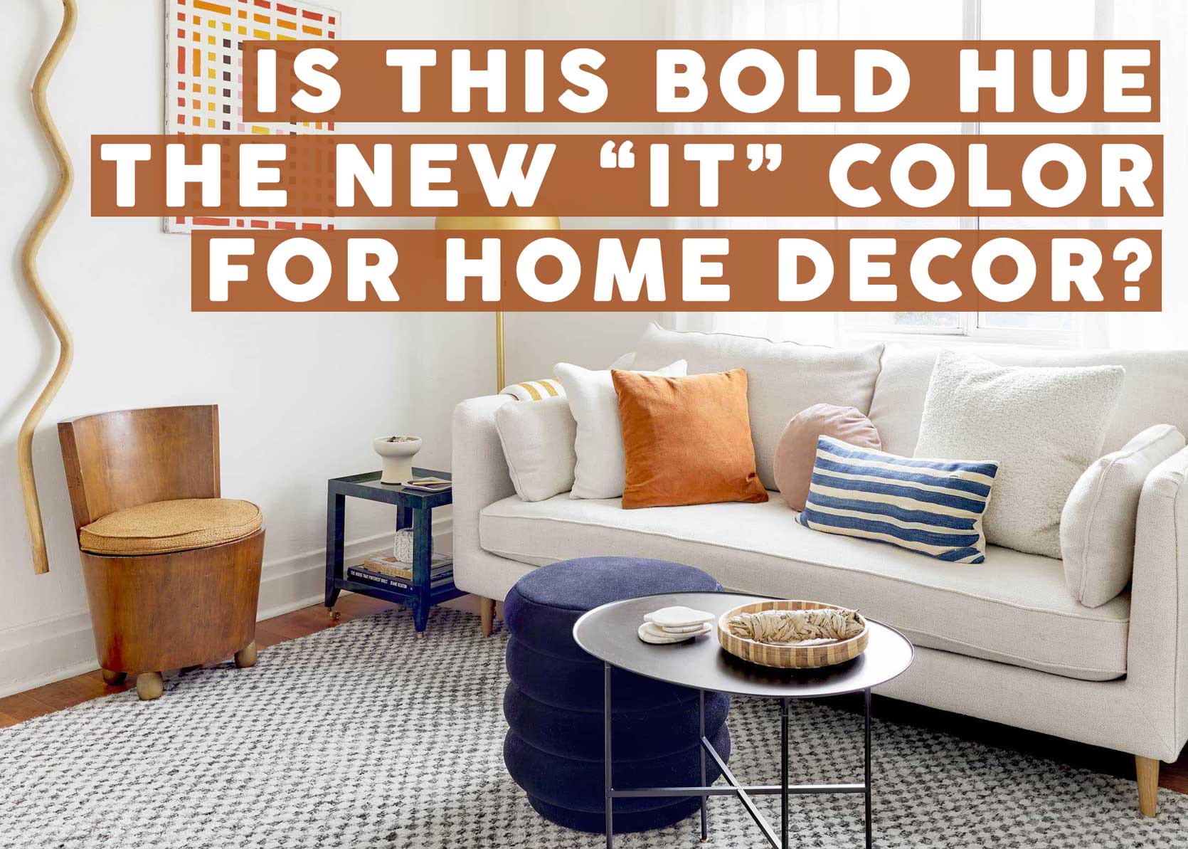
Opening Image Credits: Design & Styling by Jess Bunge | Photo by Sara Ligorria-Tramp | From: Makeover Takeover: Jess’ Long Awaited (Small Space) Living Room Reveal