For the second time in my life, I attempted the “no wrong holes” strategy towards the always intimidating gallery wall. Sure, I’ll typically lay it out on the ground, and then try my best to recreate it on the wall, but there are always some hole mistakes (usually hidden behind a piece of art so I don’t stress about it). I’ve done maybe 80 gallery walls in my life and I feel more confident than most people, but it’s neither an art nor an exact science (it’s a combination). When we had clients, aka people who don’t love random holes in their walls put there by “professionals,” I would try much harder to be accurate, but still – there would be holes. In this room, with beautiful wood paneling… you can’t easily patch and touch it up and I really really didn’t want to look at my own mistakes in this newly gorgeous room. So I put on my “detail-oriented brain” (typically missing) and tried SO HARD to make this right the first time (with help from Emily M. and Gretchen).


Ok first off, the biggest rule of the gallery wall is to collect things that you love, that work well together and for me, that means a cohesive color palette. I’ve seen this done a million ways – with random colors, mixed mediums, and totally different styles – and I think the thing that all great gallery walls have in common is unique awesome art. And it’s not as easy as that sounds. I don’t mean to be pretentious or intimidating, but where a gallery wall goes bad is when it’s just generic art thrown up to fill the space (in which case just do a diptych or large-scale readymade art – which we wrote about here and here). But if you want a dope, collected gallery wall (which by nature they should look collected), then ideally it should be full of unique, vintage, personalized, and/or straight-up good art. Again, I like a curated color palette because my brain appreciates cohesion, so all of my seascapes (which I’ve been collecting for years) are in the moody blue/green/dark world, nothing too bright or too midcentury this time. They all feel more like antiques than vintage (and yes, some were legit splurgy) most of the frames have some gold in them and are ornate.
STEP 1: Tape Out The Desired Wall Space On The Floor


I knew that I wanted to cover the wall, but have the shape be more of a square (not organic this time). So the measurements were driven by centering it above the sectional, and the height was driven by the sconces, obviously, and the top of the sofa – we wanted to stay in that visual blank space.
STEP 2: Missing Photos, I’m Sorry!
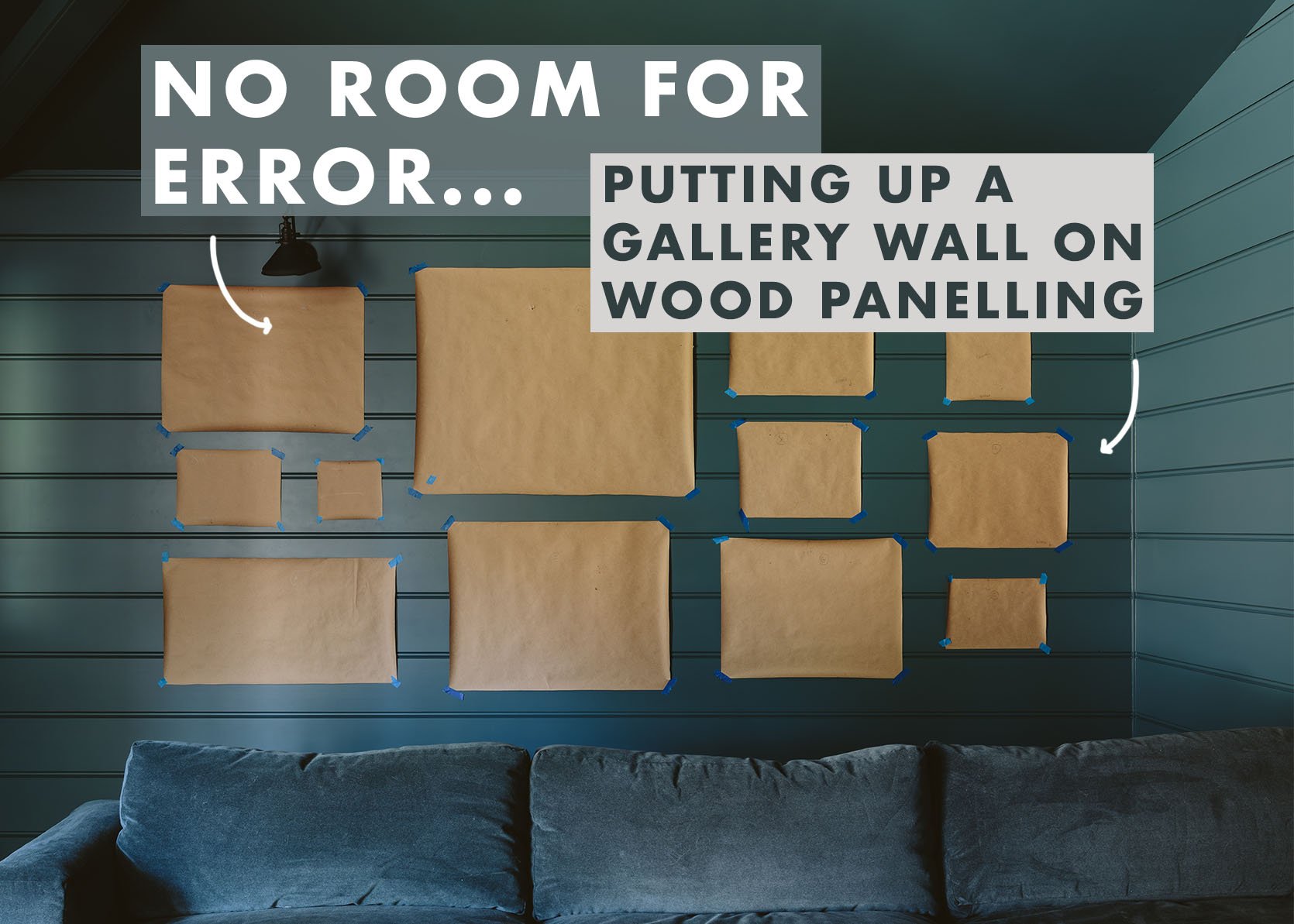
Ok, so this is a crucial step that my team did while I was shooting something else in another room with Kaitlin and we forgot to get professional photos. But basically, you take paper (I have craft paper at my disposal) and trace each piece of art, then cut it out and LABEL EACH ONE (A, B, C, etc). Then use tape to write the coordinating label on the art. Don’t forget this next step – MARK with a pen on the paper where the nail hole should go so that once up on the wall you just nail, rip, and hang. And again, LABEL THEM. This is still not a perfect science, but it will get you farther faster.
STEP 3: Play With Composition On The Floor

There are a million ways to do this, but I always start with the largest pieces, balancing them out on the wall/floor. So big go first, then the medium and small act as the filler to balance out the big.
P.S. See the pieces of blue tape on the frames? Those are my labels!

For this one, we didn’t keep perfect “rivers” between the pieces, so it’s in between a grid and totally organic. But the shape and size isn’t the only thing you need to keep in mind – it’s the color balance. One piece might feel visually “heavier” because it’s darker even if it’s small, and vice versa. You really just have to stand and stare for a LONG TIME.

We finally got it to where we were 80% happy, knowing that it would still change. Then as you tape the corresponding pieces of paper onto the wall the imbalances become more apparent, and we changed before we nailed (when it was just taped).
STEP 4: Tape Paper On The Walls In The Same Configuration

Now you can measure exactly where each one was in relation to one another, but I think that’s a waste of time (and would make my brain hurt) so we just went for it, knowing that blue tape comes up easily should you adjust (which you will). Once up, again, you might tweak even more. It’s a combination of trusting and forgiving yourself – just like life!
STEP 5: Nail Into The Marks On The Paper

Remember those nail-hole pen marks you made? Time to take a shot, pony up, and hammer in your first hook or nail. We recently started doing two hangers instead of one because it keeps them from being tweaked. So that’s why you see two hangers (and again the marks are specific to where the wire would hang on the nails, not just where the center of the wire is on the back of the frame). It was SO FUN.
STEP 6: HANG THAT ART (And Rip Off The Paper)

As it came together we were all riding high on design dopamine – when things REALLY WORK!!!!! HALELLUJAH! Not only did this method create zero mistake holes, but my goodness we loved how it looked.

And if you have a really astute eye for reading this blog (thank you very much) you’ll see that we had to pull two of the seascapes from the kitchen (flanking the range) which I was sad to see go there, but they belong here, together with their friends and family.

I’m so happy with it. You can even see it from the living room and with the sconces on their lowest dimmer it looks so inviting and dreamy. The full reveal coming soon (and I know you think you know what it’s going to look like together, but please come back to see how it’s all styled (and the two walls we haven’t shown you yet).
For those of you wanting to recreate this look, we rounded up some of our favorite online shoppable vintage or printable seascapes in this vibe. I highly recommend copying this room – the whole blue-on-blue thing with these seascapes is quite the cozy vibe.

- Vintage Rocky Beach Seascape | 2. Sail 3 | 3. Winter Bluff | 4. Baltic | 5. Seascape Painting | 6. Seafarer | 7. 1960s Maine Seascape Oil Painting | 8. Landscape Framed VI | 9. Deep Blue Waves
*Photos by Kaitlin Green