Hello EHD! Rashida here! It’s been a minute since I’ve written on the blog. For a little over a year now, I decided to add Interior Designer as one of my titles. What I thought would take me an extra few hours a week (how naive), has actually taken over most of my time. Although the schedule shift wasn’t what I planned for, creating a special haven that improves my clients’ well-being and their family’s well-being is truly the reward of this career. So with that being said, I wanted to show off two homes I’ve done. The first one is a feel-good makeover I did for a couple that really gives back to their community, so I wanted to do the same for them. The second is a design I did for a gentleman who loves to cook and entertain. These two clients are different, but there’s one theme shared across both designs, and that theme is BLUE (well, the color lol)!
Blue is no stranger to the EHD blog. In fact, I would go as far as to say, it’s a signature color here! But for me, I never actually used blue when designing. I’ve always admired the color but never had the opportunity to use it in my personal designs. After experimenting with different hues of blue, I’m finding it to be a versatile color that can be paired with other cool tones, or with hot fiery colors like red or orange.
Project One
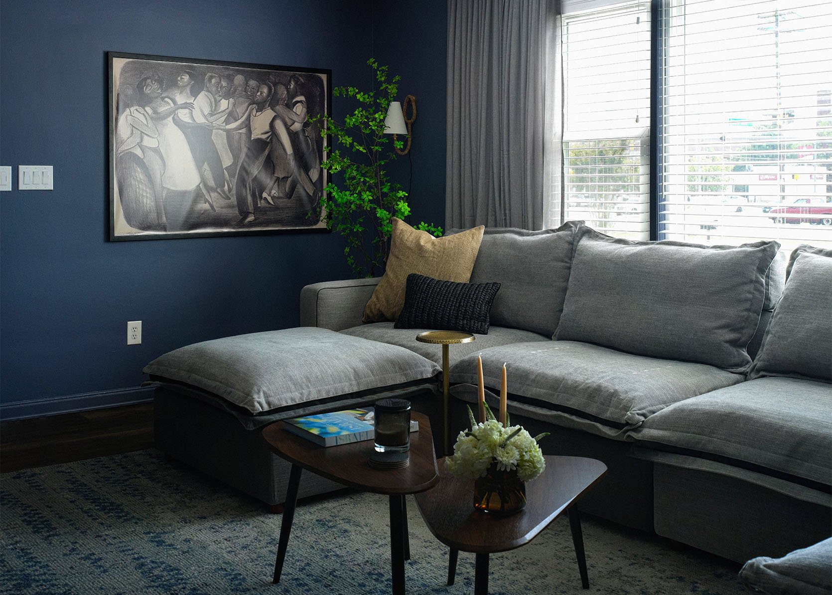
In my feel-good makeover, I designed a living room for my friends. The challenge with their space was that the room was wide and narrow as well as a pass-through room. This meant there wasn’t much opportunity for furniture layout options. So, to maximize the space I decided to do a massive U-shaped modular sectional. I love a modular design because I get to configure pieces that work for the space I’m designing. We decided to go with the Homebody 6 seater sectional. In fact, we actually configured our own sofa with 4 seats and two ottomans to make the U shape. I preferred the two ottomans over the two end seats to keep the space more open. The ottoman is a place for my friends to put their feet up when it’s just them lounging on a day after work, but when they have dinner parties, guests can utilize the ottomans as seats. They love to relax with their dog Ziggy, so the seamless recliner (in one of the center seats) is perfect.

This sofa sectional is extremely comfortable. Even if you rest your back against the arms, it’s like a pillow! We chose the color Gloomy Day In, because we love it, but also because they have a dark-colored dog, and his hairs show up less (the pups take over our lives). Now that the anchor piece was in the room, it was time to finalize the remaining details. And the question that challenged my mind was, what paint color? I wanted a color that could hold the massive sectional. It needed to be bold, and also interesting enough to play up the gray sofa. And in came my grand idea to do indigo walls. Indigo to me is like a violet blue. It has hints of purple mixed with navy blue. It’s what makes navy blue more interesting. I chose the color Blue Gaspe by Benjamin Moore. You truly do gasp when you walk into their home and the depth of the color pulls you in. You crash on the sofa and feel like you’re under the midnight sky.

Now I must say that the color is much more appreciated in person. It’s one of those colors where it’s hard to capture the true hue on camera.


Wall Color | Sectional | Rug (found mine on FB marketplace!) | Nesting Coffee Table | Drink Table | Tan Pillow | Black Woven Lumbar Pillow | Velvet Ball Pillow
To warm things up a bit I added natural wood tones, brown and even black. They had overhead lighting but layering in secondary light is one of my favorite things to do. So I installed plug-in wall sconces that are wrapped in woven cords from Troy Lighting and a wide semi-flushmount brass light from Corbett Lighting.


Project Two
Next up is my client’s home. We worked on four spaces: the kitchen, powder room, basement, and basement wet bar. He initially had a white kitchen that didn’t have a ton of cabinet storage. He wanted to add a pantry cabinet and a trash can cabinet. The problem was, I couldn’t find his exact cabinetry. The solution was to buy cabinet boxes for the new cabinetry areas and reface all the doors for a cohesive look. And since we were doing new cabinet doors, I suggested why not change the white to… you guessed it, BLUE. He was nervous, but after some convincing, we decided to go with Sherwin-Williams’s “In the Navy”. And let me tell you, the color is divine and completely transformed his home.


We bought in-stock, off-the-floor cabinets from The Home Depot, and just removed the doors. The new cabinet boxes provided pantry storage, pull-out trash can storage, and we ended up changing the whole upper cabinet layout as well. It was much cheaper to buy ready-made cabinets versus getting someone to build custom boxes. All the other cabinets we kept the same, and just tossed the doors. Switching out just the cabinet doors is not new for me. If you recall, I did it in my kitchen a few years ago. There are a few cabinet door companies that provide a custom product, and for my client’s space, we used cabinetdoors.com. The name speaks for itself!


Brass Cabinet Pulls | Brass Cabinet Knobs
To really ignite the blue cabinets, we replaced all the hardware with unlacquered brass knobs and pulls from Rejuvenation. And then we replaced all the lighting with new over-the-counter pendant lights and a new light over the dining table that sits off the kitchen. Both lights are from Hudson Valley Lighting.

Brass Faucet | Cabinet Fronts | Cabinet Color | Woven Roman Shade (in golden poppy) | Vase | Pendants

For the powder room, my client had his heart set on the Bequia wallpaper by Malene Barnett exclusively sold at Lulu and Georgia. And of course, it’s BLUE again. We removed his current sink and added an all-black wall-mounted console sink.


Now let’s move downstairs. My client has a collection of typewriters that he uses for his thank you cards, and he also has a collection of Thurgood Marshall photos. He loves to entertain and loves wine. I think he actually has a wine club. I immediately thought…let’s go with a speakeasy vibe.

We went with large format tiled floors, in the asphalt matte color. Then it was time to choose the paint color, and yes we went blue again. I loved the color Britannia Blue. It’s a moody shade of blue enhanced by a dark gray shade. The ceilings in his basement are less than 8 feet. So to distract the eye from the height, we painted everything that color. The ceiling, the walls, the doors, and all the trim.


Wall Color | Woven Roman Shade (in golden poppy) | Battery Operated Sconce | Floor Tile
The camel color curved sofa, paired with Romare Bearden’s “The Fall of Troy” art he purchased at an estate sale really gives the blue-gray walls some interest.

Media Cabinet | Sofa | Task Floor Lamp | Black Metal Nesting Coffee Table | Black Pillow | Brown Pillow (similar)


Drapery | Tall Candlestick Holders (vintage) | Rug | Accent Chair

When I first saw the wet bar, the word “uneventful” came to mind. It was great that he had one in such a small basement, but you can tell it was an afterthought from the previous owners. Initially, I was going to do a deeper blue that went well with the blue-gray walls. But I felt that there was enough blue. I had reached my blue limit. I decided to go with wood-grained cabinets stained in black. These cabinets are actually from Ikea’s Lerhyttan collection. We did the top cabinet in a glass front and the complementing base cabinet. I encouraged my client to go with a bold countertop. This granite material is called “Black Rivers”. It has so much movement! Now, I wouldn’t use it in a large space like a kitchen, but it was perfect for this small wet bar. We also tripled the size of his wine fridge, added a faucet I found on Etsy that’s made in Morocco, and found a black hammered sink from Amazon. All the details pulled together created a luxurious area in his basement.

I am so pleased with both blue spaces. Although blue is a cool tone, the depth of the color hugs you when you experience the space. It’s sophisticated and cozy! The blue tones pack punch and boldness but also provide a sense of calm. So don’t be afraid to use it. Pair the color with gray. Pair it with wood tones. Pair the color with orange tones. It’s such a versatile color that can take your space from uneventful and “safe” to a space that’s tailored and feels designer. So the next time you think about painting, try blue!
* Designs by Rashida Banks
**First Living Room Photos by Antwon Maxwell
*** Second Home Photos by Raul Rivero