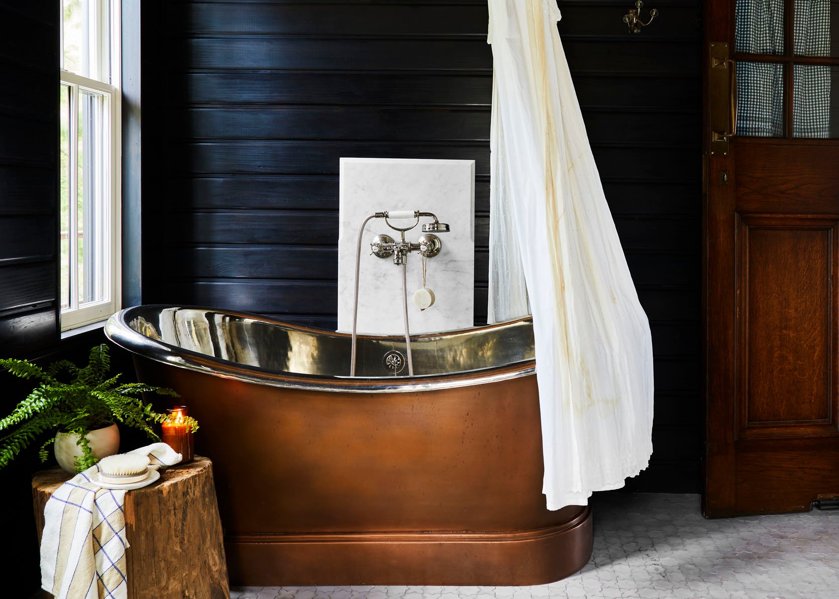
Welcome to the final and equally magical space in Anne and Richard’s Washington Coast home. If you missed the other three posts we covered the open-concept kitchen, dining and living room, the main suite, and lastly the lofted bunk rooms. It’s impossible to pick a favorite space so I will just say that this bathroom is also SO SPECIAL. Even just looking at the cropped photo above you get the design wind knocked out of you a bit. If a bathroom can be romantic this one might be the most.
The power of this copper tub is out of this world! It was purchased from Signature Hardware but this exact one is no longer in stock. It’s grand yet rustic and elegant yet simple. I didn’t know how much I’d love a copper tub but there’s some true love stuff happening over here. I also really appreciate that it isn’t hammered which isn’t always my personal favorite copper finish. This baby is smooth!
What I really love that Anne so perfectly does is nail the rustic elegant style in a really authentic way. It’s not showy or faux because each piece is thoughtfully found or built and is most likely vintage. Do you also see that door?? That is how to do rustic right. But as she said in the main suite post, her husband Richard is more traditional and you can see that incorporated in these beautiful floor tiles and plumbing fixtures.
One question I did have for Anne was, “Why did you decide to use a skinny piece of marble for the wall faucet instead of going the length of the tub?” She said, “It felt less ‘fancy’. I hope that makes sense. That was really the only reason. It is the same reason for the simple scones and the tiny mirror.”
That makes total sense to me. Scaling back on size for higher-end materials gives them an inherent sweetness rather than a bold luxury vibe. This is a hot tip for anyone designing a bathroom that wants a similar aesthetic!

I mean just LOOK AT THE INSIDE OF THAT TUB. Then add in a beautiful tree stump and you have the dream elegant, romantic, rustic bathroom:)

Emily had mentioned that Anne had her copper plumbing exposed in the ceiling so naturally I had to ask her why and this was her response: “This was due to the way the second floor is framed. There was no room to hide the plumbing. I embraced that fact and really like the bit of copper showing.”
I also really like that little bit! It ties in with the tub and just looks cool. Oh, and now you can see what she meant when she chose a small mirror and sconce so the room felt less “fancy”. ?
In case you were wondering about the black paint on the paneling, it’s also milk paint! Anne said they weren’t sure if it would hold up in a bathroom, so they had a coat of wax added.

If you are also drooling over that PERFECT vintage vanity (do you see the corners and the claw feet?!) so am I! Anne told me that it’s an antique piece she stumbled across in the vintage section at Rejuvenation. They did have to reduce the size of the backsplash a little bit to fit between the windows, but otherwise, it was great. What a total design dream!
Now, if you are a privacy curtain person, don’t worry because they have a very cute solution that we don’t see in these photos. Anne said, “For privacy, we hang antique table runners from tiny hooks in the windows. Super cute. Since we are mostly alone out here, I did not want permanent drapes.” That makes sense to me. Why block the view if you don’t have to?? ?

The final feature of this bathroom is that it connects to an outdoor shower. Yep, the perfect vacation home. But this was also a thoughtful decision for their friends. “This allows our friends who like to camp to use the bathroom without having to come into the house. It is also the shortest distance from the sauna.” (Quick! Notice that the wood of the door’s threshold matches the ceiling wood!)
It turns out that when an interior architect designs a house from the ground up, she thinks of everything:) Hope you enjoyed this house tour and we can’t thank Anne and Richard for sharing it with all of us.
Love you, mean it.
*Design by Anne De Wolf of ARCIFORM and Versatile Wood Products
**Chief Lumberjack: Richard De Wolf of ARCIFORM and Versatile Wood Products
***Styled by Emily Henderson (me!) and Emily Bowser
****Photos by Sara Ligorria-Tramp

